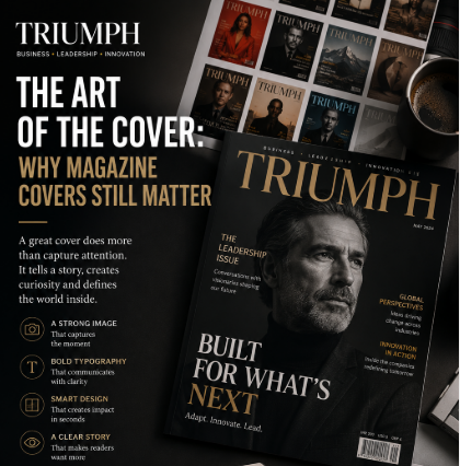
The Art of the Cover: Why Magazine Covers Still Matter
Before a reader opens a magazine, they see one thing first.
The cover.
It may take only a few seconds to look at, but a great cover can create curiosity, communicate an identity and leave a lasting impression. In an industry increasingly dominated by screens, algorithms and rapidly changing digital formats, the magazine cover remains one of publishing’s most powerful creative tools.
A cover is not simply packaging.
It is the first chapter of the story.
More Than a Photograph
The easiest way to think about a magazine cover is as a combination of an image, a headline and a logo.
But the best covers do much more.
They establish a mood.
They communicate an editorial point of view.
They tell the reader what kind of publication they are holding.
A business magazine may use a powerful portrait of a CEO.
A fashion magazine may create an image around a cultural moment.
A travel publication may use a landscape that immediately creates a sense of place.
A culture magazine might choose something unexpected precisely because it wants to challenge the reader.
The image matters.
But so does everything around it.
Typography, spacing, colour, composition and hierarchy all influence the way the cover communicates.
The Three-Second Test
A successful cover has to work quickly.
Imagine walking past a newsstand—or scrolling through a digital magazine catalogue.
There may be dozens of competing images.
The reader isn’t studying each one.
They are scanning.
A strong cover therefore needs to answer three questions almost immediately:
Who published this?
What is this issue about?
Why should I care?
If the answers are unclear, the cover has failed before the magazine has had a chance to tell its story.
This is why visual hierarchy matters so much.
The publication’s identity needs to be recognisable.
The primary story needs to stand out.
Supporting elements should add information without creating noise.
The goal is not to put everything on the cover.
The goal is to make the reader want to discover what is inside.
The Power of the Photograph
Some of the most memorable magazine covers in publishing history have been built around a single photograph.
A portrait can communicate authority.
A facial expression can communicate vulnerability.
A location can communicate ambition.
A carefully constructed scene can communicate an entire idea before the reader has read a single word.
The best editorial photography therefore isn’t simply attractive.
It is meaningful.
The image should have a relationship with the story.
Sometimes that relationship is obvious.
Sometimes it is deliberately ambiguous.
Both approaches can work.
What matters is that the photograph creates curiosity.
When Less Becomes More
Modern digital platforms encourage visual overload.
More graphics.
More headlines.
More buttons.
More movement.
More information.
Magazine design often works differently.
A powerful cover can contain very little.
One compelling image.
One strong headline.
One carefully positioned logo.
A limited colour palette.
A lot of empty space.
That restraint can create confidence.
It tells the reader that the publication does not need to shout to get attention.
Elegance often comes from knowing what to leave out.
Typography Is Part of the Story
Typography is sometimes treated as a finishing detail.
For magazine designers, it is anything but.
A serif headline can create a sense of tradition, authority and sophistication.
A modern sans-serif can communicate technology, simplicity and confidence.
Large typography can create drama.
Small typography can create subtlety.
The choice of typeface can change the personality of an entire publication.
That is why successful magazines tend to develop recognisable visual systems.
Readers may not consciously identify the font or spacing.
But they recognise the feeling.
And that feeling becomes part of the brand.
The Cover as a Cultural Snapshot
Magazines have always documented their times.
A cover can capture a political moment, a technological transformation, a cultural movement or a changing attitude toward society.
Years later, the cover becomes more than an advertisement for an issue.
It becomes a historical artifact.
This is one reason magazine covers can have such lasting cultural value.
They freeze a moment.
They show what society was talking about, who it considered important and how it wanted to see itself.
In that sense, magazine covers are not just designed for readers.
They are also designed for memory.
Digital Has Changed the Cover
The rise of digital publishing has created a new challenge.
A traditional print cover has physical dimensions.
A digital cover may appear on a desktop screen, tablet, smartphone, social media feed or search result.
The design therefore has to work at multiple sizes.
A beautiful headline can become unreadable when reduced to a thumbnail.
A subtle photograph can lose its impact on a small screen.
This has forced publishers to think about responsive editorial design.
The modern cover may need to function simultaneously as:
A magazine cover.
A website image.
A social media graphic.
A search thumbnail.
A promotional asset.
The challenge is preserving the publication’s identity across all of them.
The Cover as a Marketing Tool
There is another reason covers matter.
They sell the idea of the magazine before they sell the content.
A reader may know nothing about the issue.
The cover gives them a reason to investigate.
That makes cover design closely connected to editorial strategy.
Which story deserves the cover?
Which person should appear?
What message represents the issue?
What emotion should the reader feel?
These are not purely design questions.
They are editorial decisions.
The designer and editor therefore need to work together.
A beautiful cover with a weak story will not create a strong publication.
And a powerful story presented without imagination may never receive the attention it deserves.
The Rise of the Digital Thumbnail
One of the most interesting developments in modern publishing is the fact that a magazine cover is increasingly encountered before the magazine itself.
A reader might see it on Instagram.
Then on Google.
Then in a newsletter.
Then on a website.
Only later might they read the article or purchase the issue.
The cover has therefore become a piece of digital content in its own right.
This changes the design challenge.
The cover must still feel sophisticated when viewed in a large format—but it must also remain recognisable when reduced to a small square on a phone.
The best publishers understand both environments.
Why Great Covers Are Rare
Creating a great cover is difficult because it requires several disciplines to work together.
Editorial judgment determines the story.
Photography creates the visual.
Design establishes the composition.
Typography creates hierarchy.
Brand strategy maintains recognition.
Marketing determines how the cover will be used.
When these elements work together, the result feels effortless.
When they don’t, the cover can feel crowded, confusing or generic.
The best covers often look simple.
But simplicity is rarely accidental.
It is usually the result of many decisions.
What Makes a Cover Timeless?
Trends change quickly.
Design styles come and go.
Colours become fashionable and then disappear.
Yet some covers remain powerful decades later.
Why?
Because they are built around an idea rather than a trend.
They tell a story.
They create emotion.
They communicate something about the person, subject or moment being presented.
That is the difference between a cover that is merely current and one that becomes iconic.
The Future of the Magazine Cover
Technology will undoubtedly continue to change publishing.
We may see more interactive covers, personalised editions, animated digital artwork and entirely new forms of editorial presentation.
But the fundamental principle is unlikely to change.
Readers will still respond to strong ideas.
They will still recognise beautiful photography.
They will still appreciate thoughtful design.
And they will still be curious when something makes them stop scrolling.
The tools may change.
The canvas may change.
The audience may change.
But the purpose remains the same.
Make someone stop.
Make someone look.
Make someone wonder what is inside.
The First Impression That Lasts
A magazine cover has an unusual responsibility.
It must represent everything inside without revealing everything inside.
It must attract attention without becoming desperate for it.
It must communicate identity without becoming predictable.
And it must create curiosity without explaining the entire story.
That is why the cover remains one of the most fascinating forms of editorial design.
In a world where people encounter thousands of images every day, a truly great cover still has the power to make someone pause.
And sometimes, that pause is all a great story needs.
Because before a magazine can be read, it has to be noticed.